Do you have any idea about what is a waterfall chart? Have you got stuck anywhere while creating a waterfall chart? Did you find any difficulty? Read the below article about the waterfall chart from start to end with a detailed explanation.
We are going to explain what waterfall chart is and how it will be created by saving our time.
Waterfall chart is a powerful chart in tableau which extensively displays the cumulative effect of positive and negative data values in sequential manner.
You should know this key thing about Waterfall chart – The difference between the simple running total table calculation and waterfall chart is that the they check each of the dimension member with a positive value is getting added to the running total and the negative value is subtracted from the running total.
To create the Waterfall chart in Tableau we need one dimension and one measure.
Now How create this chart step by step:
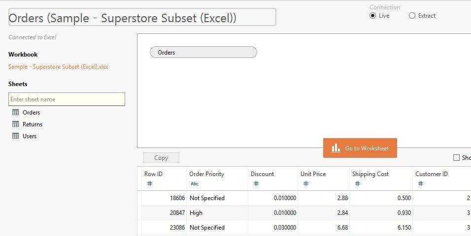
We are connecting to our favorite dataset ‘SampleSuperstore.xlsx’.
Now after successfully connected, drag the Orders sheet from the dataset to tableau. Here I will get about 9994 records in this sheet.
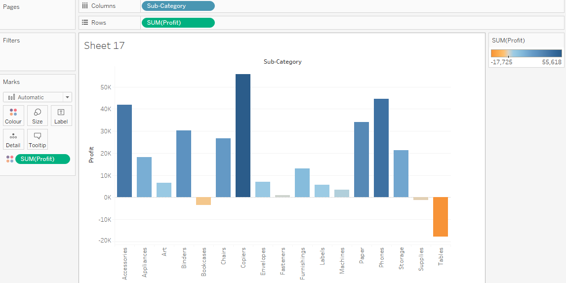
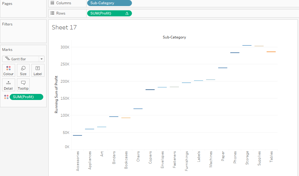
Go to sheet1 and rename the sheet as ‘Waterfall chart’. Now, Drag and drop the sub-category into the Columns shelf and [SUM(Profit)] to the Rows shelf. Add [SUM(Profit)] to color card. I can see the color of bars are changing on the basis of profit values.
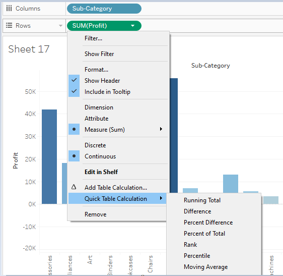
Now, Right click on the [SUM(Profit)] and click on Quick table Calculations -> Running Total
Now this is the important step to get waterfall chart ready. Here I can change the chart type from automatic to Gantt Bar. You can see here wherever there is a starting point of bar chart is displayed in the form of gantts.
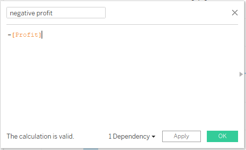
Create a new calculated field as [Negative profit] = -[profit].
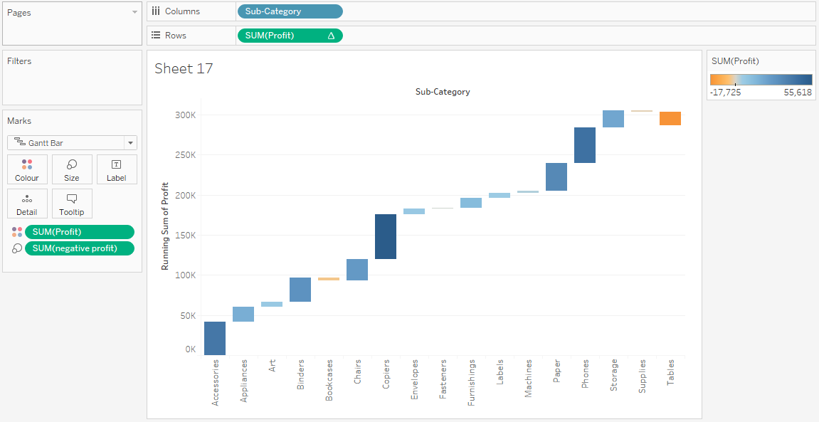
Add [Negative profit] field to the size card. You can see the size of each bar is now changed with respect to negative profit calculated field.
Now check if any formatting is remaining like color, size, details or tooltip as well as labels. After all this formatting changes my waterfall chart is looking like this:
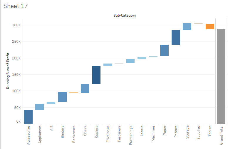
If you want to see the total at the far right of the visual or chart, then click on Analysis -> Totals in Top navigation -> choose ‘Show Row Grand Totals’. Now, I can see at last the last bar shows the total of the profit done. As shown in below figure:
Finally, some of the business logics need the decision whether I can use sort for this chart or not? But again, it will be depending on my business requirement, analysis or questions about business.
Waterfall charts are also called as Bridge charts.
We hope you have understood how we can create Waterfall chart in Tableau just in few steps with less time.
So, if you read and follow each and every step from above steps then it will be really helpful for you to create a waterfall chart and easy to understand it.


