✍ A Tableau Interview is one of the most exciting as well as a complicated thing for many of us. Simply because there is no limit to the magic of Tableau. Starting from basic charts and calculations, to advanced analytical graphics and interactive visualizations - all of which can be built in Tableau. It is, however, essential to be thorough with the fundamental knowledge and concepts of Tableau, and being able to apply them to solve various complex problems along the way. This will help in your daily work once you get the job. ✍ The essential skills an interviewer looks for is if you are thorough with calculations and practical problems, and have a clear understanding of the various features and functionalities of Tableau. Once these are there, other custom things can be learnt on the job, and as the requirements come. ✍ We, as Certified Tableau Professionals, have researched over several years and focussed on providing you with the best experience with a variety of problems from every category of a Tableau interview. Keep practicing the Free test below, and you will be ready in no time. If you are interested in Tableau Certification, check out our Tableau Desktop Specialist Practice Exam. To schedule the main Certification exam with Tableau when you are ready, choose 'Schedule Exam' from the References Menu above.

 The exam has a time limit, to give you an environment like an actual interview scenario. Conceptual and Practical problems from every Tableau knowledge area have been precisely created to evaluate your skills in every question. The answers are elaborated in details as you progress, so after every question make sure to understand the solution for a few seconds. You will have to score 70% from 30 excellent questions in 60 minutes to pass the interview below. With 1000+ questions in our database created over the years, you will be presented with a fresh set of question every time, providing you with unlimited and unmatched learning opportunity.
We have a database consisting of hundreds of quality questions created by our Certified Tableau Professionals over the years. Every time you take the below test, we provide you with a balanced new set of questions by default to maximize your exposure to all kinds of topics. We also provide you the opportunity to be able to customize the tests by the options below. Choosing any option below will present you with a new test with a completely new set of questions optimized as per your selection criterion. If the optimized login screen does not reflect within 5 seconds of choosing an option, please try again.
Tableau Practice Interview
Average Tableau Pro Salary
The Average salary of a Tableau professional is around $80,000 per year in the US, ₹500,000 per year in India, and £61,000 per year in UK. The skills for data analytics and Tableau are already in demand, and expected to grow more in future years. The pace at which data is being generated today by every organization mandates the need of a strong business intelligence application to help drive decisions. The growth of tools like Tableau to garner insights will be in demand like never before, and professionals skilled in these tools will always be highly recognized and appreciated.Learn and Practice
Improving your knowledge and being good in Tableau comes with a lot of practice, and encountering and solving unique scenarios over time. Theoretical knowledge is ofcourse essential, but using it to derive insights hands-on makes it even more effective. So ensure you exhaust all the quizzes we provide here, and keep researching and reading more on the topics which you felt needs more attention during the tests. This will help reduce the knowledge gaps gradually and help you score better as you keep learning.Overview
Colors are the most important part of any dashboard. All dashboards are incomplete without right color choice. They play major role while representing the data. They can help you to better understand data or they can misguide you about the data. Hence, colors are the major aspect of your visualization skills and choosing the right colors for right dashboards is also the important. It should always be taken into consideration while creating the dashboards.For that, in first half of the blog I have explained the existing color system of Tableau and how colors are created in tableau. Sometimes, it is difficult to find the right colors for your dashboard. Hence, I have suggested the two tools to determine the details of colors you want in the dashboard.
Tableau has only few predefined color palettes in it. So, if you want to give particular color to your dashboard it is very difficult to choose. Giving each dimension colors separately is a very tedious task. This can be solved by using customized color palettes. Tableau allows us to create a customized color palette and use it in our dashboard. So last part of this blog will contain, how to create such customized color palette In tableau dashboard.
So, let’s start!
We will first learn about the different color systems of Tableau and then understand how to create a customized color palette in Tableau.
Color systems of Tableau
- HSV (Hue-Saturation-Value)
- Hue –
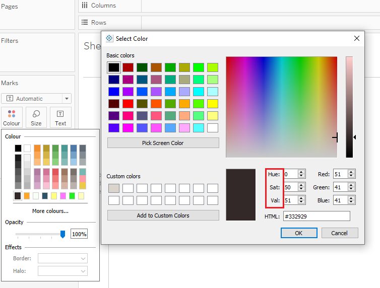
Hue is nothing but the wavelengths present in color. All colors like Red, Orange, Yellow, Green, Blue, Indigo and violet have their own distinctive wavelengths. So, choosing the Hue means choosing the wavelength of color which you want. In color graph Hue goes from left to right and its value ranges from 0 to 359.
- Saturation –
Saturation is the amount of grey color present in the color. In color graph Saturation goes from bottom to top. Bottom most point of color graph has a saturation value of 0 (Full grey) and top most part of color graph has saturation value of 255 (Full hue). Saturation value of 0 refers to the 100% grey value and 255 refers to the 0% grey value. Hence, at 255 saturation your color will the color which you have selected in the hue.
- Value –
Value is the amount of black or white color present in your color. Value is also known as brightness or luminosity of color. Basically, value determines the shade of your color. In color graph, the bar on the right side represents the Value. When the arrow is on the top it represents 100% of white color & when the arrow is at bottom it represents 100% of black color. Value ranges from 0 to 255, hence you can select the value of your choice and give shades to the color based on the value.
- RGB (Red-Green-Blue)
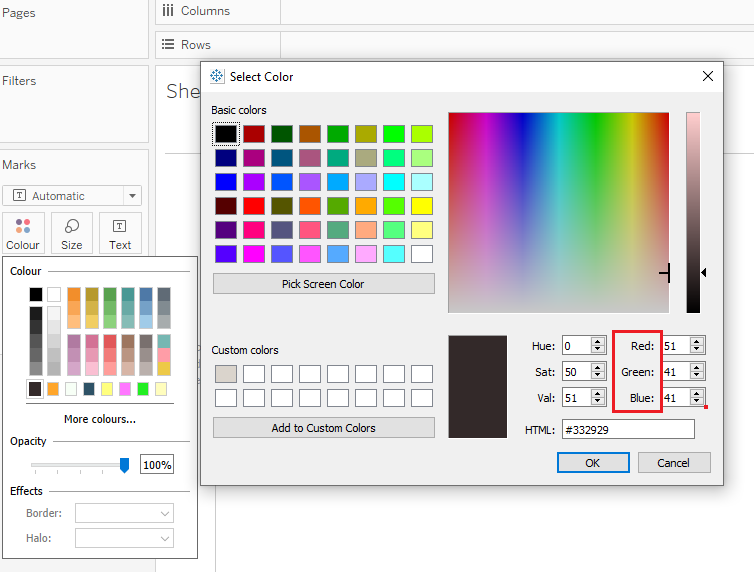
RGB color model stands for Red Green Yellow. It is a additive color model in which various colors are prepared by adding different amounts of the three main colors those are Red, Green and Yellow. In this model, you have to select the amounts of the colors which ranges from 0 to 255.
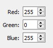
For example – If Red = 255 , Green = 0 , Blue = 255
Then we get the Violet color. Similarly, you can select combination of RGB value to create many colors.

- HTML CODE
HTML code system is generally known as HEX code color system. This system is similar to the RGB color system. In this system, RGB values are converted to the hex codes. The format of writing HTML color code is #RRGGBB .By changing the hexadecimal values of Red , Green and Yellow part of HTML code, different colors can be obtained. The range for using the HTML code is #000000 (Complete black) to #FFFFFF (Complete white).
Where to find colors for your palette?
Color palette is the collection of colors used in the dashboard. It is important to select better colors which complement each other in your visualizations. For most of people, selecting the color palette is very difficult task to imagine. Hence, following two tools might help you in this regard.
- Coolors.co
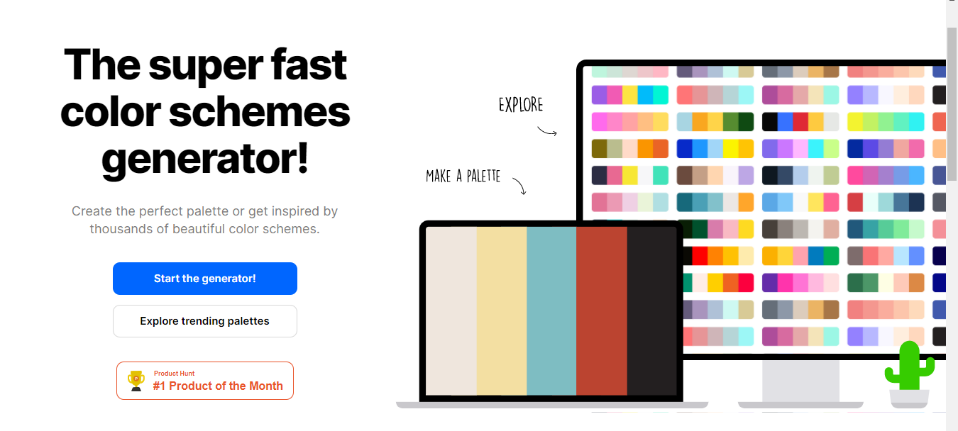
After you click that button, one random color palette will be shown to you. If you like the any particular color in the palette then you can click on “Toggle Lock” button and save that color to your palette. If you don’t like the colors then just click the space button and your color deck will be reshuffled. If you have locked any color then it won’t change. Other colors will adjust accordingly. You can add, remove or move the colors based on your requirements. Once you are finished with selecting your color palette, you can download the color palette where you can find the all the color information about colors in all color systems. Suppose you have selected the palette shown in picture above. Then just note down the hex codes of all the colors. We will use them to create our own color palette in tableau.
- Color-Hex.com
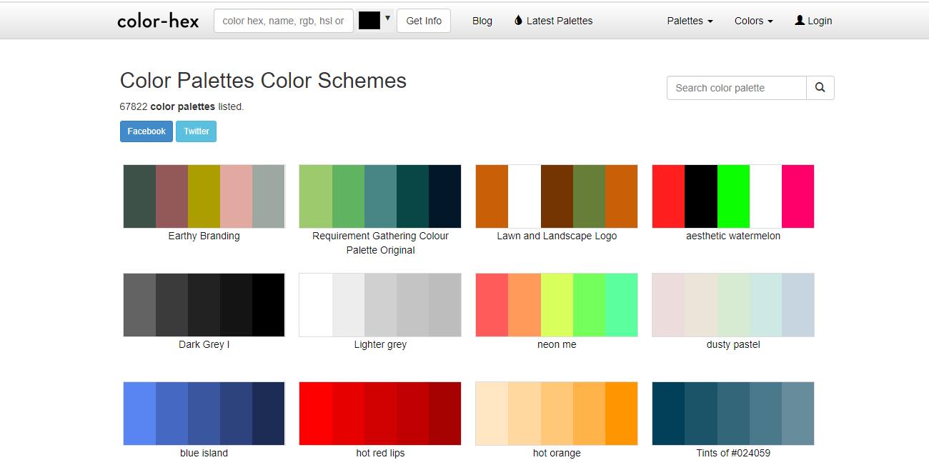
You can click on any of these palettes and use them in your dashboard. As all of these palettes are readymade, you don’t need to think about colors. Just pick the one which suits your dashboard most. After selecting your palette, note down the hex-codes of all the colors which we will use in creation of custom palette.
Now you have colors which you are going to use in the palette in the form of hex-code. Hence, let’s start with creating the customized dashboard.
Steps to create customized color palette
- Get the hex-codes of colors –
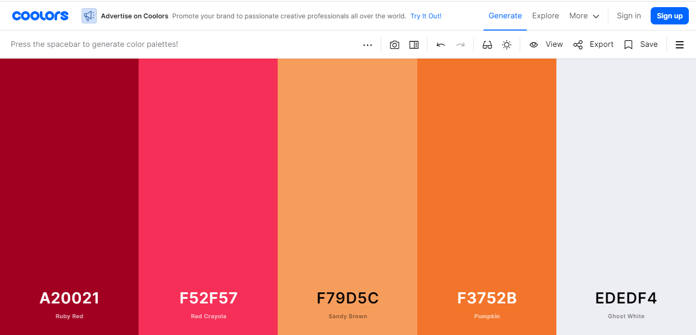
For the purpose of this blog, we are taking an example of color palette used in picture of cooler.co explanation. So, the palette is –
Color 1 – #A20021
Color 2 – #F52F27
Color 3 – #F79D5C
Color 4 – #F3752D
Color 5 – #EDEDF4
The first step is to note down all the colors in hex-code system.
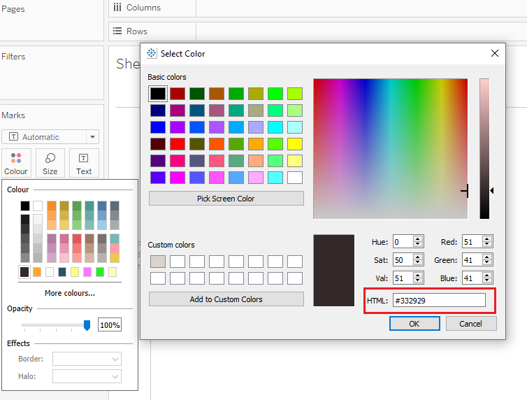
- Go to the Preference File In Your Tableau Repository
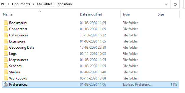
Go to This PC > Documents > My Tableau Repository . There you will find the file names ‘’Preferences”. Right click on this file and click on “Open With” and in that select “Notepad”. Notepad window will be opened and something like this will appear.
- Edit the Preferences file
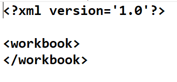
To add your own palette to the Tableau, you will need to edit this file. This file contains the HTML code for preferences in tableau. To create our own custom color palette in Tableau, you will need to use three tags i.e. preferences, color-palette and color. We will use these tags in following standard HTML code and write hex-codes of our own color palette in it.
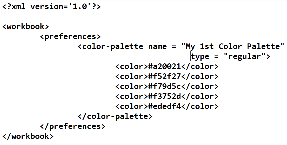
The tag <color-palette> helps us in defining name and type of the color palette. While the tag <color> helps us in defining the hex-code colors which we are going to use in our palette. If you write this code in preferences file then new color palette named “My 1st Color Palette” will be created in the Tableau, which you can use for your dashboards.
- Open the Tableau and use the palette you have created
Now after editing the preferences file, open the tableau software. (If tableau is already opened then close it and open it again). Your palette is ready to be used. You just need to restart the Tableau and then use it in your dashboard.
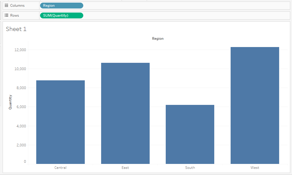
To test whether our palette is created or not we will do small experiment by using superstore data.
Step 1 - From superstore data, drag the Region to the columns and set the view to entire view
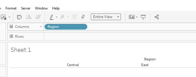
Step 2 – Select the Quantity and drag it to the Rows
When you drag Quantity to the rows, a bar plot will be created. But this bar plot will have only one color. Hence, we will add some color to this dashboard.
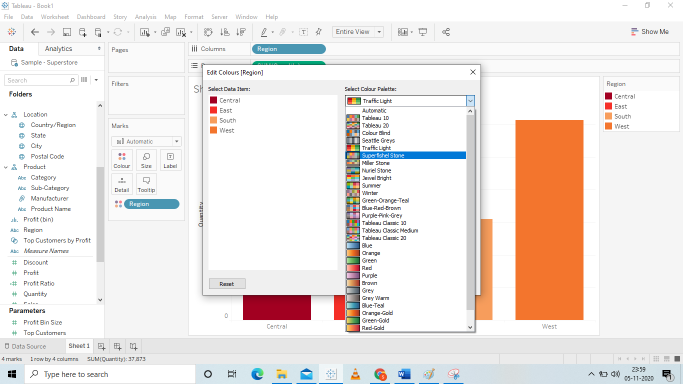
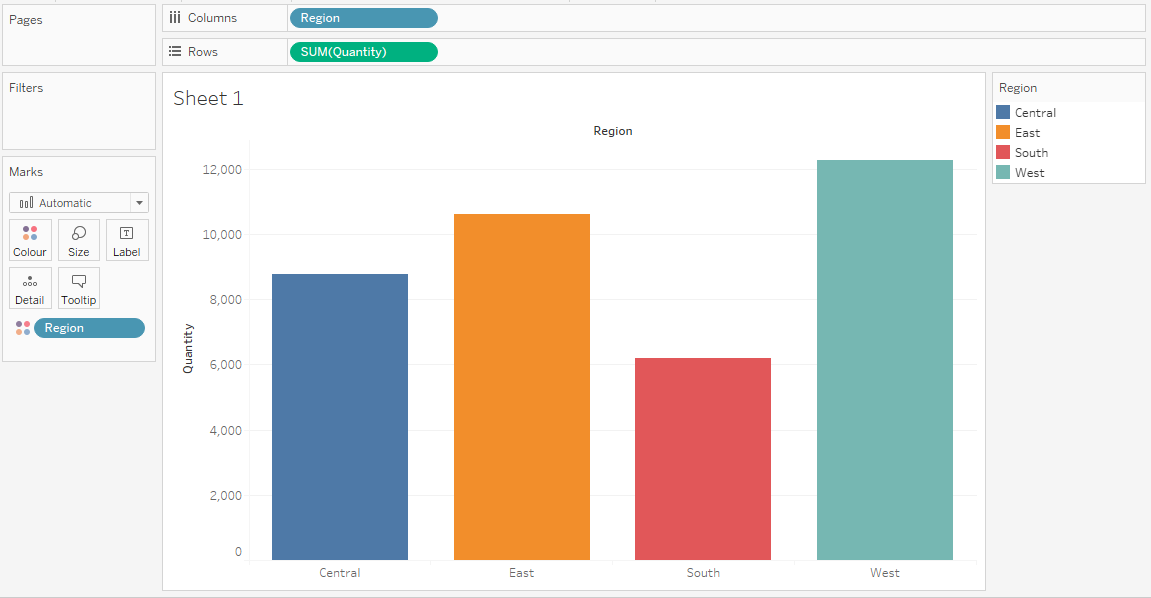
Step 3 – Drag Region on the color so that automatic color palette will be assigned to the bar plot
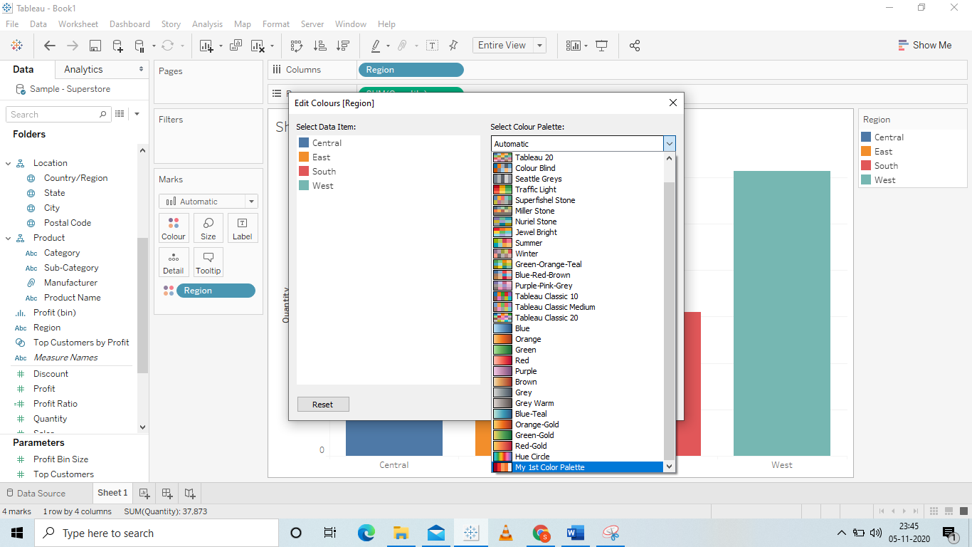
Step 4 – Apply your custom color palette to your dashboard
For this, click on the color legend. Then click on the edit colors option. Then select your own color palette.
Step 5 – Your customized color palette is applied
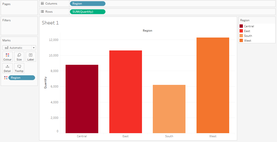
So, this is the way you can add your customized color palette and chose the colors of your dashboards wisely. This will definitely increase your visualization skills and you will be able to convey the information more powerfully.
Overview of Qlik
In a Tableau interview, knowledge about other products in the same domain asserts your strong position in the field of business intelligence. QlikView and Qlik Sense are two such popular tools owned by Qlik software. Let's learn a few details about how Qlik fits into the Data Analytics world.QlikView & Qlik Sense
✍ Qlik (formerly known as Qliktech) provides an end-to-end platform which includes data integration, user-driven business intelligence and conversational analytics. The software company was founded in 1993 in Lund, Sweden and is now based in King of Prussia, Pennsylvania, United States. The company's main products are QlikView and Qlik Sense, both software for business intelligence and data visualization.✍ Qlik Sense is a cloud-native data analytics platform offering a powerful and complete solution for modern BI, and with an AI-powered analytics experience and rich in various customization features. QlikView is a classic analytics solution that helps build and deploy interactive, guided analytical applications and dashboards using a flexible development environment without dependence on stack technology.
Qlik Landscape
✍ Qlik also offers Data Integration products like Qlik Replicate which is used for universal data replication and data ingestion, Qlik Compose which is an agile data lake and data warehouse automation tool, Qlik Gold Client to streamline your SAP test data management and SAP modernization initiatives, Qlik Enterprise Manager to centrally manage data replication and pipeline automation across the enterprise, Qlik Catalog (formerly Qlik Data Catalyst) for modern data management and cataloging for the enterprise, and several other products.✍ Qlik also offers Developer Platforms like Qlik Analytics Platform to build simple mashups, create custom analytics or embed rich and engaging analytics into any application, portal and more. Let's take a deeper look below. The below video dives into how QlikView helps with data analysis.
Understanding QlikView
The below video gives a detailed insight into the features and capabilities of Qlikview.
Qlik Sense
✍ Now let's take a look at Qlik Sense. QlikView is the first-generation BI solution from Qlik that drove the shift in the market away from large, IT-driven, stack-based technologies to more agile data discovery approaches, kicking-off a data analytics revolution. In 2014, Qlik Sense, a next-generation platform for modern, self-service oriented analytics was introduced which supports the full range of analytics use cases across an organization — from self-service visualization and exploration to guided analytics apps and dashboards, conversational analytics, custom and embedded analytics, mobile analytics, reporting, and data alerting.✍ For the enterprise, Qlik Sense provides a modern, cloud-native platform with open and standard APIs, powerful data integration and connectivity, and centralized management and governance. Qlik Sense also enables associative exploration and innovative augmented intelligence capabilities, thus helping increase data literacy for all types of users. Let's learn more about Qlik Sense below.

Tableau vs QlikView
A detailed comparison between Tableau and QlikView is explained in the video below. Both are analytical tools, yet both offer a very unique set of experiences to the end-users and developers.
Qlik Products
An overview of all the Qlik products is described in the below video. QlikView aims to be a self-service Business Intelligence application, and lets users interact and generate insights from their data in a variety of ways.
Overview of Cognos
Cognos is an analytical reporting tool which is considered as a peer product of Tableau. It provides comprehensive analytical capabilities, a robust AI-assistant for smart reporting, and interactive visualization opportunities. IBM has moved a lot of it's Watson Analytics functionalities into Cognos which has made it even more Artificial Intelligence capable with strong Machine Learning abilities. Let's take a deeper look at Cognos and how it fits into our Tableau interview landscape.History
Cognos (Cognos Incorporated) was an Ottawa, Ontario-based company making business intelligence (BI) and performance management (PM) software. Founded in 1969, at its peak Cognos employed almost 3,500 people and served more than 23,000 customers in over 135 countries until being acquired by IBM on January 31, 2008. While no longer an independent company, the Cognos name continues to be applied to IBM's line of business intelligence and performance management products.Rich in AI
✍ Cognos aims at driving certainty in decision-making with AI-powered analytics. Along with predictive reporting powered by Artificial Intelligence and Machine Learning, Cognos also provides integration ability with third party products like SAP and Relational databases. NLP (Natural Language Processing) is used in Cognos by which it can respond to user questions and respond in natural sentences, sometimes even highlighting data patterns that are not so obvious.✍ It is interesting to note that Cognos Analytics has positioned itself strongly in the field of smart data discovery, augmented analytics, automated predictive analysis, and pattern recognition. Cognos also provides various functionalities to automate and accelerate data processing activities. The below video demonstrates the capabilities of Cognos Analytics and the possibilities it brings with it.

Quintillion bytes of data are being processed gracefully every day using Tableau to derive insights and key performance metrics. Some of the top organizations leveraging the benefits of Tableau are LinkedIn, Amazon, Ferrari, Adobe, Cisco, Deloitte, Walmart, Experian, Lenovo, Red Hat, Nissan, Verizon, JPMorgan Chase, Siemens, Coca-Cola, Whole Foods, Wipro, Sony Music, Box, Yahoo, Randstad, Honeywell, and more.
Overview of MicroStrategy
MicroStrategy Incorporated is a company that provides business intelligence (BI), mobile software, and cloud-based services. Many of the features and functionalities it provides are similar to Tableau. Founded in 1989 by Michael J. Saylor and Sanju Bansal, the firm develops software to analyze internal and external data in order to make business decisions and to develop mobile apps. It is a public company headquartered in Tysons Corner, Virginia, in the Washington metropolitan area. Saylor is the CEO and chairman of the board.Robust Features
The below video demonstrates some of the most powerful capabilities of MicroStrategy. The company aims at empowering users to query their data using MicroStrategy, similar to how we use a search engine today to lookup answers to our questions.
Brief Tutorial
The below MicroStrategy Tutorial demonstrates step by step starting from MicroStrategy introduction and installation, to creating prompts, filters, metrics, dashboards and more.
History
✍ Saylor started MicroStrategy in 1989 with a consulting contract from DuPont, which provided Saylor with $250,000 in start-up capital and office space in Wilmington, Delaware. Saylor was soon joined by company co-founder Sanju Bansal, whom he had met while the two were students at Massachusetts Institute of Technology. The company produced software for data mining and business intelligence using nonlinear mathematics, an idea inspired by a course on systems-dynamics theory that they took at MIT.✍ In 1992, MicroStrategy gained its first major client when it signed a $10 million contract with McDonald's. It increased revenues by 100% each year between 1990 and 1996. In 1994, the company's offices and its 50 employees moved from Delaware to Tysons Corner, Virginia. On June 11, 1998, MicroStrategy became a public company via an initial public offering. In 2000, the company founded Alarm.com as part of its research and development unit.
✍ On March 20, 2000, after a review of its accounting practices, the company announced that it would restate its financial results for the preceding two years. Its stock price, which had risen from $7 per share to as high as $333 per share in a year, fell $120 per share, or 62%, in a day in what is regarded as the bursting of the dot-com bubble. In December 2000, the U.S. Securities and Exchange Commission brought charges against the company and its executives. A lawsuit was subsequently filed against MicroStrategy and certain of its officials over fraud.
✍ In December 2000, Saylor, Bansal, and the company's former CFO settled with the SEC without admitting wrongdoing, each paying $350,000 in fines. The officers also paid a combined total of $10 million in disgorgement. The company settled with the SEC, hiring an independent director to ensure regulatory compliance. In February 2009, MicroStrategy sold Alarm.com to venture capital firm ABS Capital Partners for $27.7 million. The company introduced OLAP Services with a shared data set cache, to accelerate reports and ad hoc queries.
✍ In 2010, the company began developing and deploying business intelligence software for mobile platforms, such as the iPhone and iPad. In 2011, the company expanded its offerings to include a cloud-based service, MicroStrategy Cloud. In 2013, MicroStrategy sold Angel to Genesys Telecommunications Laboratories for $110 Million. In January 2014, the company announced a new feature of the platform called PRIME (Parallel Relational In-Memory Engine), co-developed with Facebook. In October 2014 the company announced plans to lay off 770 employees, a month after reducing Saylor's salary from $875,000 to $1 at his request.
✍ In June 2015, MicroStrategy announced the general availability of MicroStrategy 10. In the Fall of 2018, the company released Microstrategy 11. In January 2019, MicroStrategy announced the general availability of MicroStrategy 2019. In February 2020, the company announced its latest release, Microstrategy 2020, including a new design for its HyperIntelligence analytics tool. In August 2020, MicroStrategy invested $250 million in Bitcoin as a treasury reserve asset, citing declining returns from cash, a weakening dollar and other global macroeconomic factors.
Overview of SAS
A prominent tool in the analytical world besides Tableau is SAS (previously "Statistical Analysis System"). SAS is a statistical software suite developed by SAS Institute for data management, advanced analytics, multivariate analysis, business intelligence, criminal investigation, and predictive analytics. SAS was developed at North Carolina State University from 1966 until 1976, when SAS Institute was incorporated. SAS was further enhanced in the 1980s and 1990s with the addition of new statistical procedures, additional components and the introduction of JMP. A point-and-click interface was added in version 9 in 2004. A social media analytics product was added in 2010.The below tutorial provides a clear picture about how SAS fits into the analytical world, and it's architecture and features.

SAS Software Suite
SAS is a software suite that can mine, alter, manage and retrieve data from a variety of sources and perform statistical analysis on it. SAS provides a graphical point-and-click user interface for non-technical users and more through the SAS language. The SAS language is a computer programming language used for statistical analysis, created by Anthony James Barr at North Carolina State University. It can read in data from common spreadsheets and databases and output the results of statistical analyses in tables, graphs, and as RTF, HTML and PDF documents.SAS Language
The SAS language runs under compilers that can be used on Microsoft Windows, Linux, and various other UNIX and mainframe computers. The SAS System and World Programming System (WPS) are SAS language compilers. For the uninformed, in computing, a compiler is a computer program that translates computer code written in one programming language (the source language) into another language (the target language). The name "compiler" is primarily used for programs that translate source code from a high-level programming language to a lower level language (e.g., assembly language, object code, or machine code) to create an executable program.SAS DATA Steps
SAS programs have DATA steps, which retrieve and manipulate data, and PROC steps, which analyze the data. Each step consists of a series of statements. The DATA step has executable statements that result in the software taking an action, and declarative statements that provide instructions to read a data set or alter the data's appearance. The DATA step has two phases: compilation and execution. In the compilation phase, declarative statements are processed and syntax errors are identified. Afterwards, the execution phase processes each executable statement sequentially. Data sets are organized into tables with rows called "observations" and columns called "variables". Additionally, each piece of data has a descriptor and a value.SAS PROC Steps
The PROC step consists of PROC statements that call upon named procedures. Procedures perform analysis and reporting on data sets to produce statistics, analyses, and graphics. There are more than 300 named procedures and each one contains a substantial body of programming and statistical work. PROC statements can also display results, sort data or perform other operations.SAS Macros
SAS macros are pieces of code or variables that are coded once and referenced to perform repetitive tasks.Publishing with SAS
SAS data can be published in HTML, PDF, Excel, RTF and other formats using the Output Delivery System, which was first introduced in 2007. The SAS Enterprise Guide is SAS's point-and-click interface. It generates code to manipulate data or perform analysis automatically and does not require SAS programming experience to use.The below tutorial similar to the above provides a clear perspective on what SAS is and the services it delivers.


