Are you getting any idea by hearing the name of this article? Did you guessed anything by reading the name of this article?
Great! you got it!
Everyone knows what is funnel which is used in day to day life activities.
So, in analytics how this Funnel is used or how to fit our business logics as per the shape of funnel? That is what we are going to discuss in this article.
What is Funnel chart and where do we use the funnel chart?
Funnel chart is a chart designed the same as a funnel shape. From top to bottom the size goes on decreasing. Funnel charts are basically used to represent sales at different stages, different segments or different sectors. Funnel charts are used to track the progress of different workflows of projects. Also helps to identify the bottlenecks found if any.
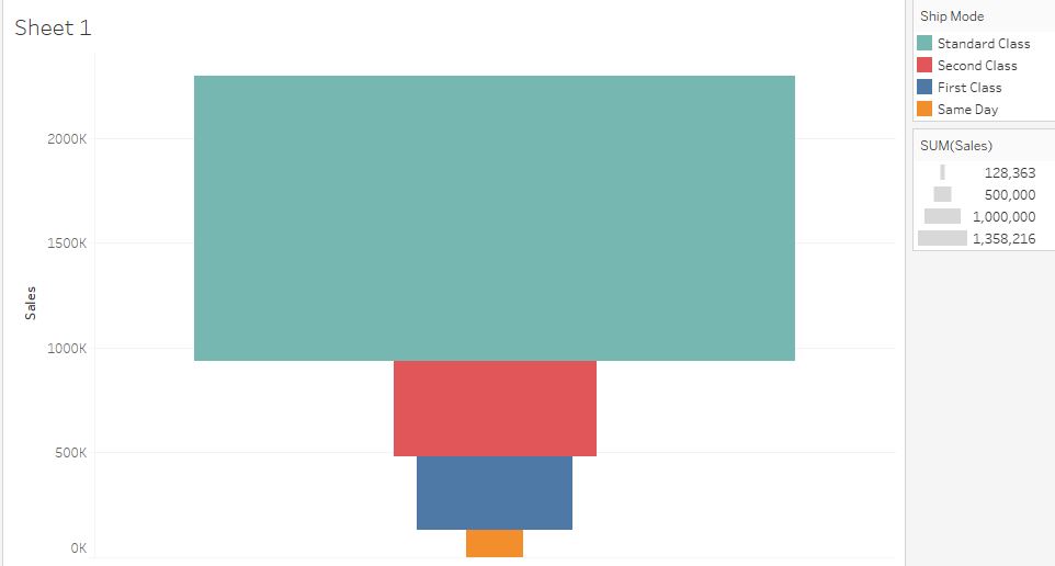
If you can see below image of Funnel chart:
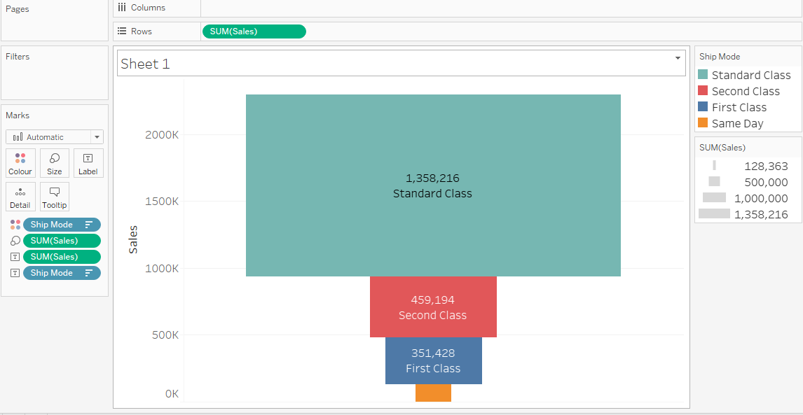
In this chart we are trying to display sales done at different Ship modes.
So, in above funnel chart has horizontal bars placed for each ship mode shown in different colors. The size of the bars showing the amount of sales done at particular Ship Mode in the entire data.
In funnel the topmost part is known as head and bottom is know as the neck part. So, this is given as the basic funnel chart example.
I will also be going to discuss about how to create this funnel chart in 30 seconds only. There are some advanced funnel charts also that I can create easily in Tableau.
Let’s see how we can create this funnel chart:
Connect to our favorite dataset ‘Sample Superstore.xls’. And drag the ‘Orders’ sheet in Tableau.
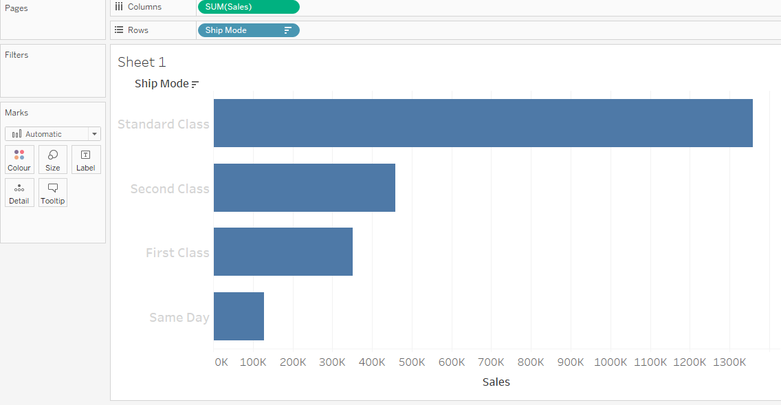
Create a new sheet in Tableau. Drag and drop the [Sales] into Rows shelf and [Ship Mode] into the color shelf of marks card in Tableau.
Now I can see there is stacked bar chart created which has sales values are separated by different colors with respect to Ship Modes.
As shown in below image:
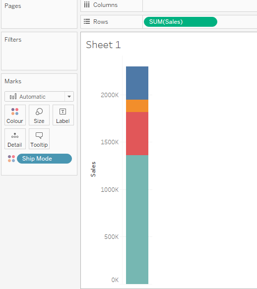
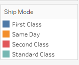
You can check the color mapping in color legends.
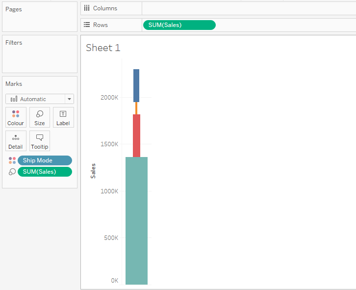
Now I want to change the size of these bars as per the sales values per Ship Mode.
So, now I will drag the sales into the size shelf in marks card. Now the size of bars is changed as per sales amount.
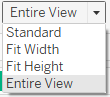
To view the chart in full workspace, click on drop-down in toolbar which has Standard to Entire view.
Now the compressed chart will be full screen in the workspace as below image:
I want to see the what that bars are and what the sales values for each bar contains? So, I will drag [Ship Mode] and [Sales] into the Label cards and increase the size of label font just by formatting labels. Also change the number format to percentage to get better analytical approach.
So, this is a basic funnel chart I have created here.
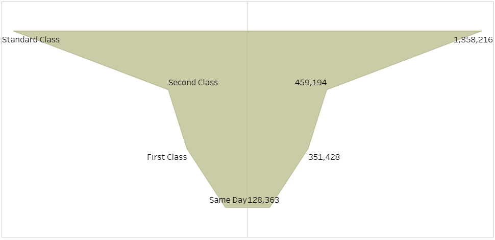
Now, we are going to explain how to create advanced funnel chart as below image:
Drag and drop the [Ship Mode] on Rows shelf and SUM(Sales) in Column shelf. I am getting a good column chart. Swap the fields in shelf and see I got bar chart.
Change the chart type from Bar to Area chart where the area between axis and exact value is completely filled.
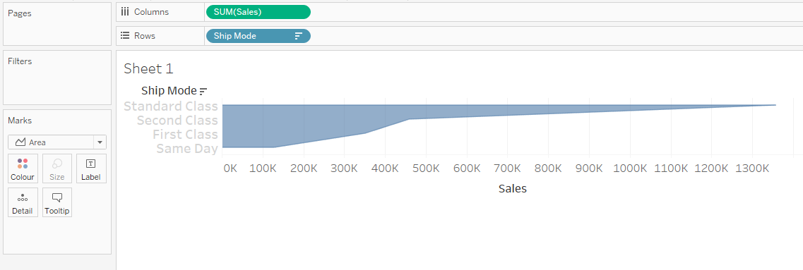
Change the view from Standard to Entire view.
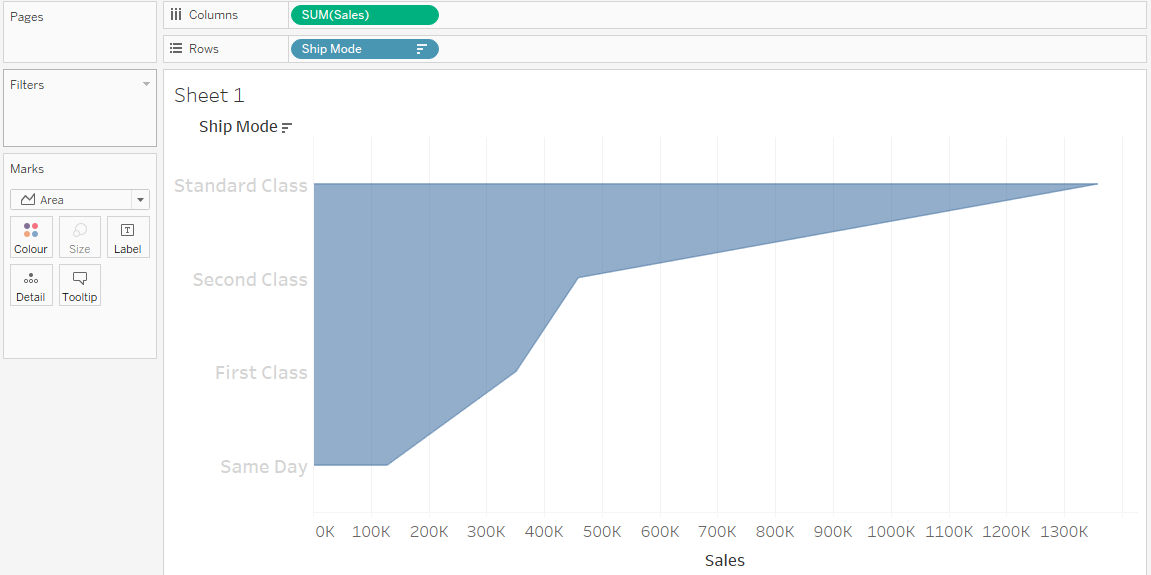
Now you can see the half funnel is getting created which is only on the positive side of axis starts from 0. But we need negative side of funnel also to complete the funnel shaped chart. So, we will create a negative field.
Create a calculated field as [Negative Sales] = -[Sales]. Drag and drop this calculated field in Columns shelf but before the SUM(Sales). If you see, I got complete funnel chart designed.
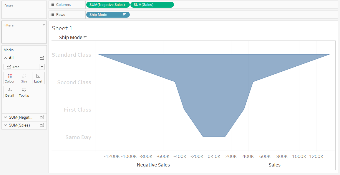
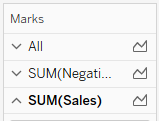
If you see the Marks card, there are two charts are getting displayed. As below image:
Now we can format this chart as per requirement like I want the [Ship Mode] and SUM(Sales) to be displayed in the chart. So, we will put them into the labels shelf.
Here in our funnel chart, the left side I want to display labels for ship mode and on right side we want to display the sales. So, for this case we will click on respective chart in Marks card like Click on first chart in marks card and add only [Ship Mode] in Labels shelf and click on below chart in marks card and add only SUM(Sales) into the labels shelf of marks card.
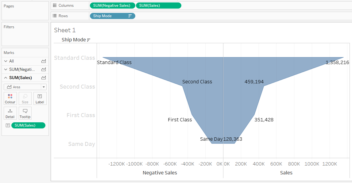
We can change the color also by changing the color in marks card color shelf.
So, here you can see what we got now:
So, this is our funnel chart designed.
Wrap Up!
Finally! We hope you have a really better idea of what is funnel chart and its specifications in the analytics field. Also, you might have got a good idea about how to create a funnel chart in a quicker way.


