What is Doughnut Chart and when to use it?
How can we create Doughnut chart in Tableau?
There are certain steps which can be followed to get Doughnut chart build in Tableau:


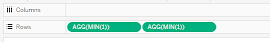
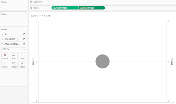
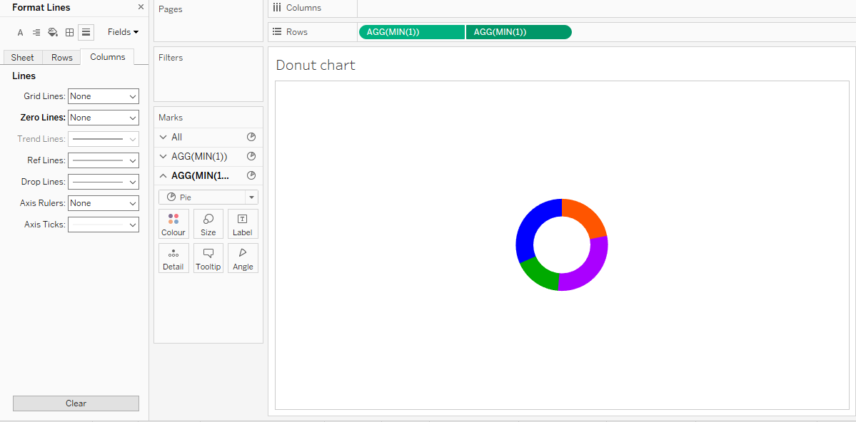
In rows shelf, double click and write MIN (1) double. It will show as AGG (MIN (1)).
Here you can see the two pie charts plotted as below image:
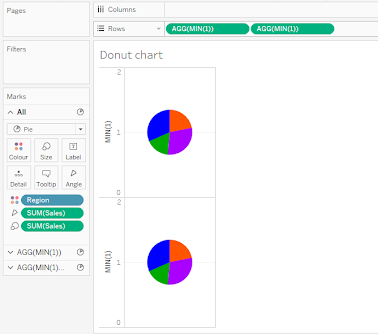
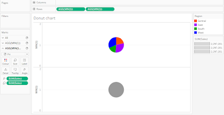
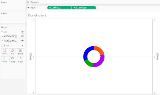
Also, you can see in the marks card SUM(Sales) into the Angle as well as in Size shelf. And there are two graphs available in marks card now. All contains both graphs and below that AGG (MIN (1)) shows first pie chart and below one shows all the cards for second pie chart. That means whatever changes I am doing in specific marks card will be reflected on the respective graph or pie chart. Suppose if we are removing [Region] from color shelf from second marks card then my second pie chart will be grayed.
Likewise, I can remove SUM(Sales) from size then the size of that pie will be default size.
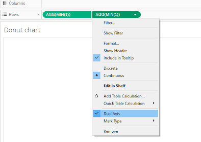
Right click on any one green pill in Rows shelf i.e. AGG (MIN (1)) and click Dual axis. I can see here both Pie charts are getting overlapped on each other.
If you change the size of any, it will change the respective chart’s size.

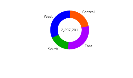
Now, I will adjust the marks cards data fields as per Doughnut chart. As I will color the inner default colored pie chart to white color, also I need to increase the size of the upper pie chart to more than inner pie. Now you can see here that a ring-shaped chart is displayed in the workspace.
It also has SUM(Sales) into angle card So it will get the size of arcs will be changed with respect to sales values.
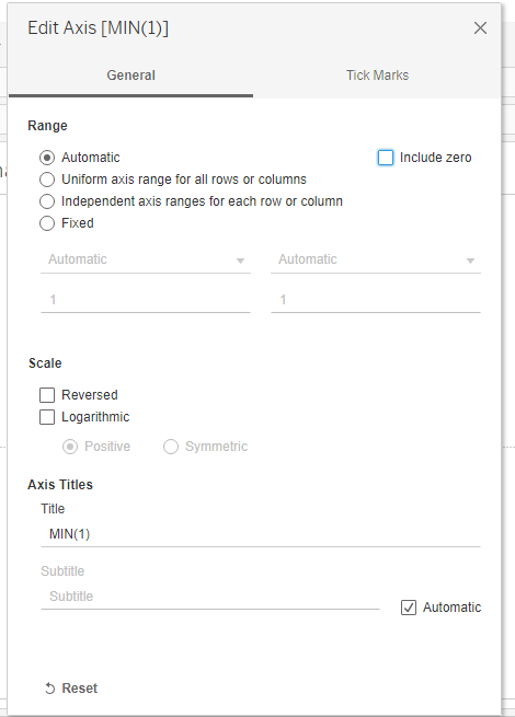
Now format the axis by double click on the axis then you will get below window up. Just uncheck the checkbox of Include zero.
Now, right click on axis and click on the Show header as below image:
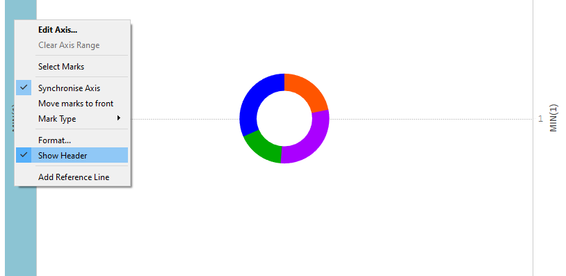
Our axis ruler will go away. Now I want to remove the middle-dotted line in chart, for that I can right click on blank space on the same worksheet. And click on the format. In line formatting change zero line from dotted (-------) to None.
Now, do all formatting as much as you want or as per business requirement. Like add Sales and Region to labels shelf, change color if you wish, etc.
Here is our Doughnut chart (Doughnut chart) ready.
As Doughnut chart is advantageous there are some disadvantages also. We are explaining those disadvantages below:
We cannot show negative performance or composition by using Doughnut chart. For example, If I have profit as a measure to be displayed in Doughnut chart, then if there is loss in any region then there is limitations and this chart will not be used any more.
If the dimension which is used for level of detail. In above use case we have used Region dimension. If this dimension has more than five to six divisions or department then in that case Doughnut chart will not be used as it will create some discrepancies while analyzing data in chart. Like if two divisions are differing in a small amount then it might be critical to identify the exact value.
Also, most of the times for huge amount of data, one should not use pie chart or Doughnut chart as it will be risky in some point of view.
Thus we have successfully explored all the important aspects of a Doughnut chart.


