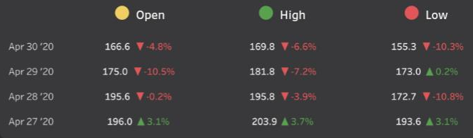
 We see a variety of comparison charts every day which shows the percentage or actual value of increase or decrease from it's prior value. Such increase or decrease figures are often colored in green and red respectively. We can achieve the same in Tableau by using calculations. We will need to split it into two, one to return the label when it's positive, one when negative:
// Green label "▲ "+STR(IF SUM([Measure]) > 0 THEN SUM([Measure]) END)
// Red label "▼ "+STR(IF SUM([Measure]) < 0 THEN SUM([Measure]) END)
We can then put both of these onto text, then put them side by side in the text editor, formatting them the correct colour. A slightly easier way is with custom number formatting. If we format our [Measure] (right click the pill > Format > select the Pane tab, then select Numbers under the default section and choose custom at the bottom). Positive and negative formatting is separated by a semi-colon in that box so to get the formatting in the above we would need the following:
▲ 0.0%; ▼ -0.0%
We can then just drop a simple boolean SUM([Measure])>0 calculated field on colour and select green and red as appropriate.


